So you've got an idea for an iPhone app -- along with everyone else on the planet. Set your app apart with elegant design, efficient usability, and a healthy dose of personality. This accessible, well-written guide shows you how to design exceptional user experiences for the iPhone and iPod Touch through practical principles and a rich collection of visual examples.
Whether you're a designer, programmer, manager, or marketer, Tapworthy teaches you to "think iPhone" and helps you ask the right questions -- and get the right answers -- throughout the design process. You'll explore how considerations of design, psychology, culture, ergonomics, and usability combine to create a tapworthy app. Along the way, you'll get behind-the-scenes insights from the designers of apps like Facebook, USA Today, Twitterrific, and many others.
- Develop your ideas from initial concept to finished design
- Build an effortless user experience that rewards every tap
- Explore the secrets of designing for touch
- Discover how and why people really use iPhone apps
- Learn to use iPhone controls the Apple way
- Create your own personality-packed visuals
Ten Tips for Crafting Your App’s Visual Identity  |
 |
- Choose a personality. Don’t let your app’s personality emerge by accident. Before you start designing, choose a personality for your app. The right personality for the right audience and features makes an app irresistible and creates a bonafide emotional connection. Tapworthy designs have the power to charm and beguile.
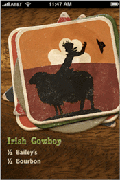
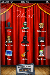
Voices (left) has a Vaudeville personality appropriate to a funny-voices novelty app. iShots Irish Edition (right) creates a gritty dive-bar ambience for its collection of drink recipes.
- Favor standard controls. Because they’re commonplace, the standard set of controls is sometimes dismissed as visually dull. Not so fast: commonplace means familiarity and ease for your audience. Conventions are critical to instant and effortless communication. Before creating a brand new interface metaphor or inventing your own custom controls, ask whether it might be done better with the built-in gadgetry.
- A coat of paint. Standard controls don’t have to be dreary. Use custom colors and graphics to give them a fresh identity. This technique requires a light touch, however; don’t distract from the content itself or drain the meaning from otherwise familiar controls.
Wine Steward uses standard lists (known as table views in iOS) but creates a vintage ambience by draping a backdrop image across the screen. The app adds a parchment graphic to the background of each table cell, making each entry appear to be written on an aged wine label. The burgundy-tinted navigation bar maintains the app’s wine flavor.
- • You stay classy. Luxurious textures applied with taste increase your app’s perceived value.
- • Keep it real. Realistic lighting effects and colors create elements that invite touch and create an emotional attachment. They also provide subtle guidance about what your audience can interact with.
- • Borrow interface metaphors from the physical world. Lean on users’ real- world experience to create intuitive experiences. People will try anything on a touchscreen, for example, that they’d logically try on a physical object or with a mouse-driven cursor. Besides these practical benefits, using an everyday object as an interface metaphor imbues an app with the same associations that folks might have with the real McCoy--a shelf of books, a retro alarm clock, a much-used chessboard, a toy robot.
- • Don’t be afraid to take risks. Make sure your interfaces are intuitive, sure, but don’t be afraid to try something completely new and different. Designers and developers are hatching fresh iPhone magic every day, and there’s still much to explore and invent. While you should look hard at whether you might accomplish what you need to do with standard controls, it’s also worth asking, Am I going far enough?
- The app icon is your business card. The icon carries disproportionate weight in the marketing of your app, and it’s important to give it disproportionate design attention, too. Be descriptive more than artistic. Make your app icon a literal description of your app’s function, interface, name, or brand.
- Use a dull launch image. Disguise your app’s launch image as the app background for a faster perceived launch. Always cultivate the illusion of suspended animation when switching in and out of your app.
- Be kind to new users. Provide simple welcome-mat pointers for first-timers. Beware of more complex help screens; they’re warning signs of an overcomplicated interface.


